Understanding Garmin Sleep Stress: What Those Orange Bars Actually Mean
Garmin Sleep Stress: What Those Orange Bars Actually Mean
As a cycling coach, I’m constantly preaching the “Physiology First” gospel: listen to the engine, not just the dashboard. But lately, I’ve been my own most difficult athlete. I’ve been analyzing my Garmin Sleep Stress while deep in the trenches of “outdoor mania” labor. While the work is finishing, my internal recovery is starting to crater, and my watch is letting me know in bright orange.
Last night was the perfect example of why duration is a vanity metric if the quality isn’t there. If you’ve been following my Physiology First training methodology, you know that recovery is where the gains are actually made. My day ended with a 90-minute commute to travel only 5.3 miles, missed dinner, and a plate of tepid leftovers. I’m not a “12-Stepper,” but after a day that grinds you down like that, the urge for a beer is strong. I resisted, but the “stress tax” was already logged.
Understanding Your Garmin Sleep Stress Score
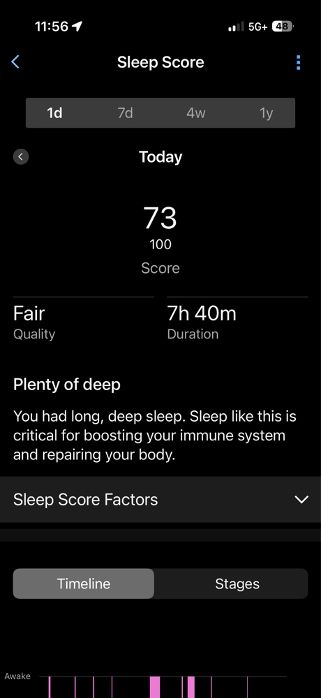
On paper, my sleep looked great: 7 hours and 40 minutes. But my body doesn’t care about the clock. My Garmin Sleep Stress data revealed a Sleep Score of 73 (Fair) because I had 51 restless moments. My Body Battery only recharged +46 points—not enough for a 55-year-old engine prepping for the Halo Loop course.
My Sleep Score hit 73 (Fair) despite nearly 8 hours of duration, proving that time in bed doesn’t equal quality recovery.
Why the Orange Bars Mean You Aren’t Recovering
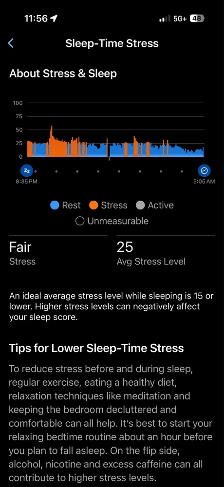
The “orange” in your Garmin Sleep Stress chart represents your sympathetic nervous system staying active when it should be yielding to the parasympathetic “rest and digest” system. My average stress level was 25. According to Garmin’s physiological guidelines, an ideal overnight average is 15 or lower.
The raw data: 51 restless moments and a sympathetic heart rate of 55 bpm confirm the body was under high stress.
I fell asleep fast, but at 2:50 AM, I woke up wired. Even in the gap before I fell back asleep, the Garmin Sleep Stress was solid orange. I wasn’t resting; I was effectively “simulating” sleep while my internal systems were still stuck in traffic.
The Stair-Step to a 68 HRV Stress Score
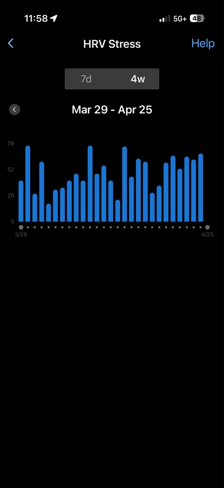
The most telling sign of this compounding debt is my morning HRV Stress test. Over the last few days, I’ve watched this climb in a steady, aggressive “stair-step” pattern, peaking today at a 68. This bar chart shows the cumulative effect of the labor—the engine is running hotter every morning.
The “stair-step” to exhaustion: My morning HRV Stress scores have steadily climbed as the labor debt accumulated.
A 68 is a loud, flashing red light. While my immediate Garmin Sleep Stress is a definitive warning sign, it’s also important to look at the macro view. This is where my consistency hub comes in.
The Macro View: My 28-Day HRV Status
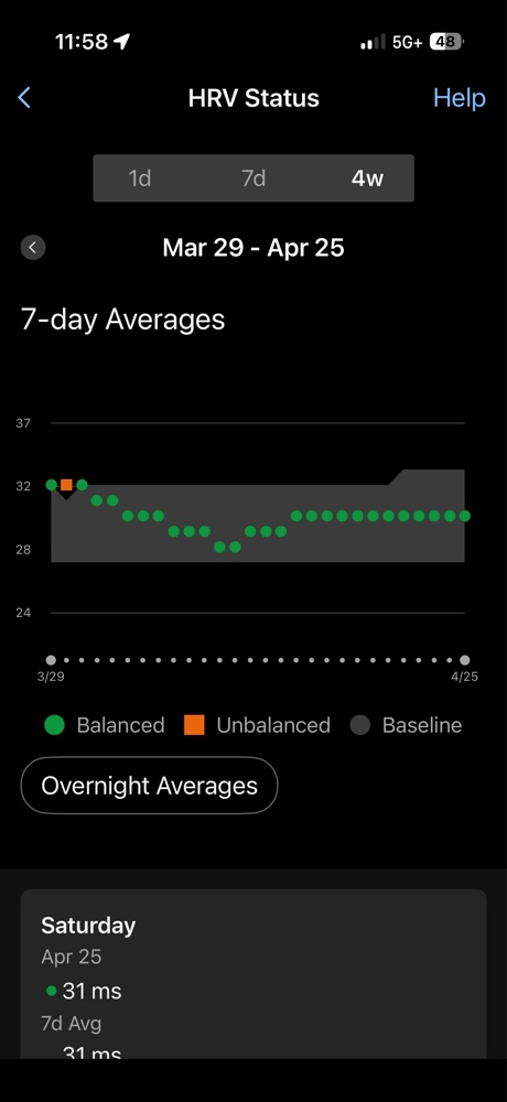
While my immediate daily Garmin Sleep Stress shows that my system is redlined, I have managed to maintain a consistent macro trend. My 28-day status is a testament to the long game of Physiology First.
The fragile balance: While my 28-day status (the hub of the Physiology First wheel) is technically “Balanced,” the immediate daily load (Image 3) is a powerful warning sign. This is a macro view that requires micro management.
My overnight Sleep-Stress baseline is technically “Balanced” at 31ms. This is the hub of the Physiology First wheel—consistency. But a balanced hub doesn’t help if your spokes (Image 3) are broken. This image shows the long-term work, but it must be managed with daily micro-adjustments. This multi-day trend of recovery failure in the short-term will eventually crash this macro chart if I don’t listen to the warning signs now.
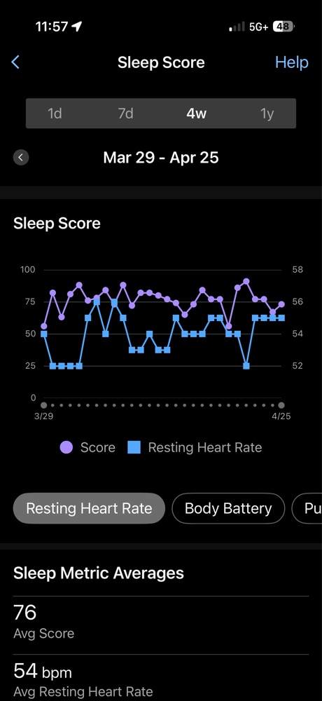
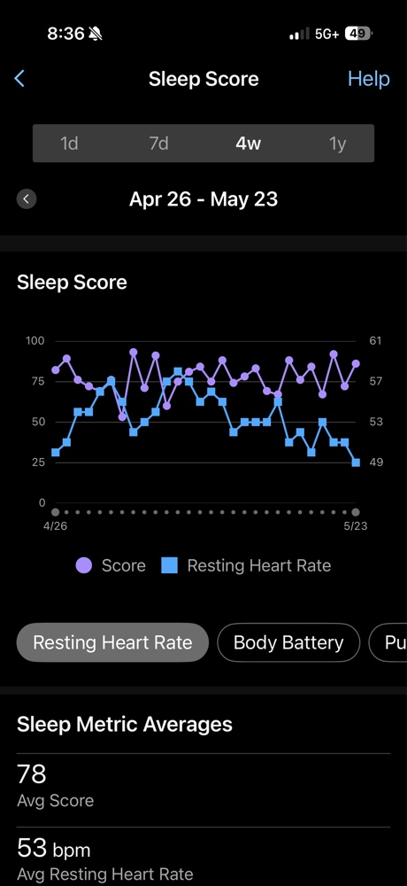
The Long-Term Trend: Sleep Score vs. Resting Heart Rate
To really understand the impact, I have to look at the other macro 4-week trend. By overlaying my Sleep Score with my Resting Heart Rate (RHR), the “Physiology First” story becomes even clearer. As the physical load of the “outdoor mania” increased, look at what happened to my RHR.
The engine’s cooling system: As my RHR (blue line) ticks upward, my Sleep Score (purple line) starts to crater, showing the true cost of my current workload.
My RHR (the blue line) has begun to tick upward toward 55 bpm, while my Sleep Score (the purple line) has become increasingly volatile. This inverse relationship is the hallmark of over-reaching. My engine is losing its efficiency because the cooling system—my sleep—is compromised by stress.
Final Takeaway: Listen to the Engine
The data doesn’t lie: you can’t out-sleep a day that ends in a 90-minute crawl and a missed dinner. If you see those orange bars, it’s time to throttle back. Today isn’t a day for chasing watts; it’s a day for managing the engine. If I don’t see those orange bars turn back to blue tonight, the labor stops until the Garmin Guru says otherwise.
Check your own Garmin Sleep Stress tonight. Are you actually recovering, or are you just lying in the orange? Physiology First, always.